 Physix Frontier
Digital human promo video production: practical tips

Physix Frontier · Project Retrospective
A Post-Mortem on Producing a 77-Second Digital Human Promo Video
A digital human website promo video under 77 seconds went through voiceover confirmation, segmented generation, page occlusion, navigation cropping, and subtitle/audio-video sync issues. This records how MiniMax Design, Liblib, Remotion, HyperFrames, and local audio/video tools divided the work, and which checks are worth doing in advance.
Recently, I created a website promo video for Physix Frontier targeting AI content creators.
The final delivered video was less than 77 seconds, but it went through voiceover confirmation, digital human generation, website screen production, subtitle adjustments, transition rework, and checks for two release versions.
The most representative feedback came from two screenshots of the finished cut: "The character is blocking the page" and "The top of the page isn't fully displayed."
Both issues occurred after the video could already play normally. The character could speak, and the pages were included, but the content viewers actually needed to see was blocked by the composition.
This article records the useful lessons from this production: how the tools divided the work, where rework tends to happen, and how I ultimately broke down and solved the problems. If you're also preparing to make website intros, product demos, or digital human talking-head videos, you can use this workflow as a starting point.
First, Determine Why the Audience Should Watch
Physix Frontier has entry points for company info, reviews, talent, creator alliance, etc. It's easy to initially follow the site navigation and introduce "what's here, what you can click there." But this video was primarily for UP hosts (content creators), so a feature list wasn't enough to answer their most pressing questions.
I anchored the opening on two specific scenarios: You seriously produce a review episode, but once the hype passes, the work is quickly buried by the information feed; tutorials are scattered across different platforms, and viewers stumble upon one piece of content but can't see the creator's complete body of work.
Only then did I introduce the website, explaining how articles, work links, related sections, and creators establish connections.
There was also an important boundary here: The website was still building its content at the time, so we couldn't write unstarted corporate partnerships, order cases, or revenue promises as already realized benefits. The final messaging focused on content display, portfolio accumulation, authentic expression, and participating in co-creation, without promising orders, traffic, or income just for joining.
Getting these statements accurate first helps determine which pages to showcase later and avoids major script changes after producing the digital human talking head.
What Each Tool Was Responsible For
This wasn't done entirely within one software. In the pre-production phase, I produced and confirmed the voiceover using MiniMax Design, then created the digital human talking-head assets with Liblib; in post-production, I orchestrated the local project via Codex to handle visuals, subtitles, audio processing, and checks.
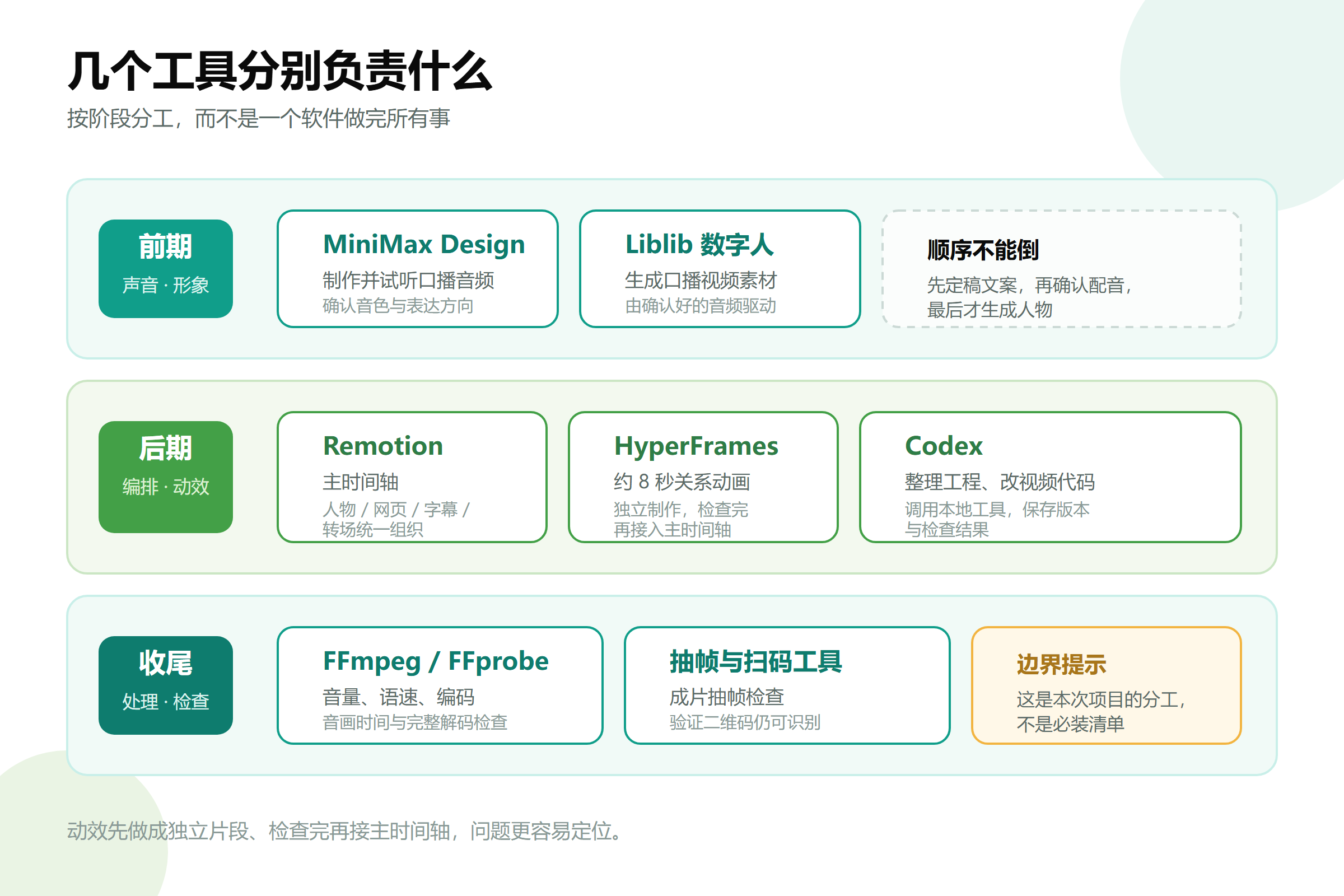
Remotion handled the orchestration of the entire video, while HyperFrames managed an ~8-second relationship animation segment. Making motion graphics into independent clips first, checking them, and then integrating them into the main timeline makes issues easier to locate.
This diagram shows the division of labor for this project, not a checklist that "everyone must install everything." If you're just doing a static character with subtitles, there's no need to introduce so many steps from the start.
Finalize Voiceover Before Doing Digital Human Lip-Sync
The most underestimated rework cost in pre-production is changing the script.
Editing text is fast, but already generated character videos won't automatically update lip-sync with new copy. If the new voice says something different, simply replacing the audio track or stretching the video usually isn't enough to fix the lip-sync issue.
Therefore, a more reasonable order is: finalize the script, confirm the voiceover, and finally drive the digital human with the confirmed audio. When significant script changes are needed, regenerate the corresponding talking-head segments or use a workflow that truly supports lip-sync regeneration.
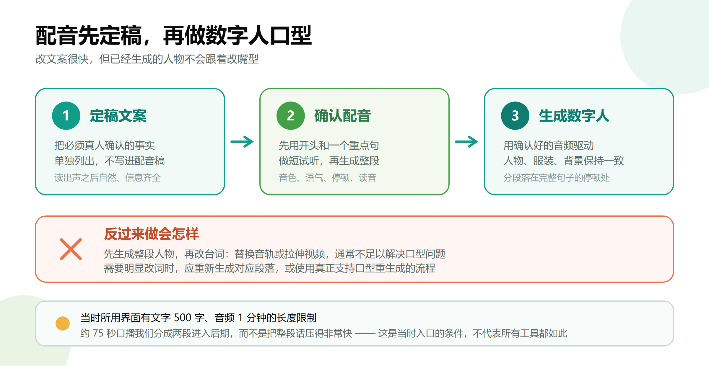
Another limitation I encountered this time was that the interface used had length requirements for text and audio uploads: text under 500 characters, audio upload max one minute, plus file size controls. This refers to the entry point used at the time and doesn't mean all models or current plans have the same limits.
To handle the ~75-second talking head, I used two asset segments in post-production rather than compressing the entire speech very fast just to fit the upload limit.
When splitting segments, it's best to land on pauses between complete sentences; both segments should continue using the same character, clothing, background, composition, and voice. Placing the splice point near a website demo or process explanation can mitigate the abruptness caused by camera pose changes, but don't rely on masking visuals to hide missing dialogue or broken audio.
Adding Energy to the Voice Isn't Just About Turning Up Volume
The first round of feedback wanted the voice to be more natural and energetic. Here we need to distinguish three issues: low volume, flat delivery, and dragging pace. They aren't the same thing.
Simply increasing volume makes the sound louder but doesn't automatically generate emphasis, emotion, or pauses. Post-production EQ, compression, and slight speed adjustments cannot replace the performance during the voiceover stage.
This time, post-production used restrained processing: cutting some low-frequency muddiness, lightly brightening the vocals, appropriately controlling dynamic range, and then speeding up the voice, character visuals, and subtitles together by 4%. The original 80-second composite timeline became approximately 76.97 seconds.

I didn't just speed up the audio while letting the character video play at the original speed; otherwise, even if the beginning looked normal, things would likely drift out of sync later.
The processed audio measured an integrated loudness of approximately -14.52 LUFS and a true peak of approximately -1.50 dBTP. The former can be understood as how loud the whole segment sounds, while the latter observes whether peaks have headroom. These are the results for this video, not mandatory standards for all platforms.
Background music remained behind the vocals. This video used locally synthesized lightweight scoring, supporting the narration through sparse front sections, enhanced middle sections, and fading back sections, without letting drum beats overpower the talking head.
After export, I also checked the audio track timing. One export showed about a one-frame overall delay and loudness change, which was fixed by re-compositing and calibrating. When fixing visuals later, I directly reused the confirmed audio track to avoid re-processing sound every time the layout changed.
Break Reference Videos Down into Visual Rules
I had a reference video on hand. What was truly useful wasn't just its colors, rounded corners, or character image, but how it allocated viewer attention.
When the character is full-screen, the visual focus is on the explanation, with a few keywords appearing beside the shoulder. When entering software demos, the page becomes the main visual, and the character shrinks to the corner. When abstract relationships need explanation, switch to diagrams, using arrows and cards to aid understanding.
I organized my video with this logic: Opening addresses creator pain points, middle showcases website pages and content relationships, and the end explains participation methods and creative boundaries.
However, the reference clip's composition couldn't be copied verbatim. Their page having ample whitespace doesn't mean my website has the same space. Character frames, web pages, and explanatory text all need rearranging based on your own content.
Character Frame Placement Matters More Than Zoom Effects
This was particularly evident during the rework of the Talent page.
Initially, I wanted to zoom in on the character when the phrase "Copyright of works still belongs to you" appeared, while overlaying an explanatory card. Emphasis was achieved, but the character blocked the bottom-left area of the webpage, and the explanatory card occupied the center of the page. Although the website visual existed, viewers couldn't read it completely.
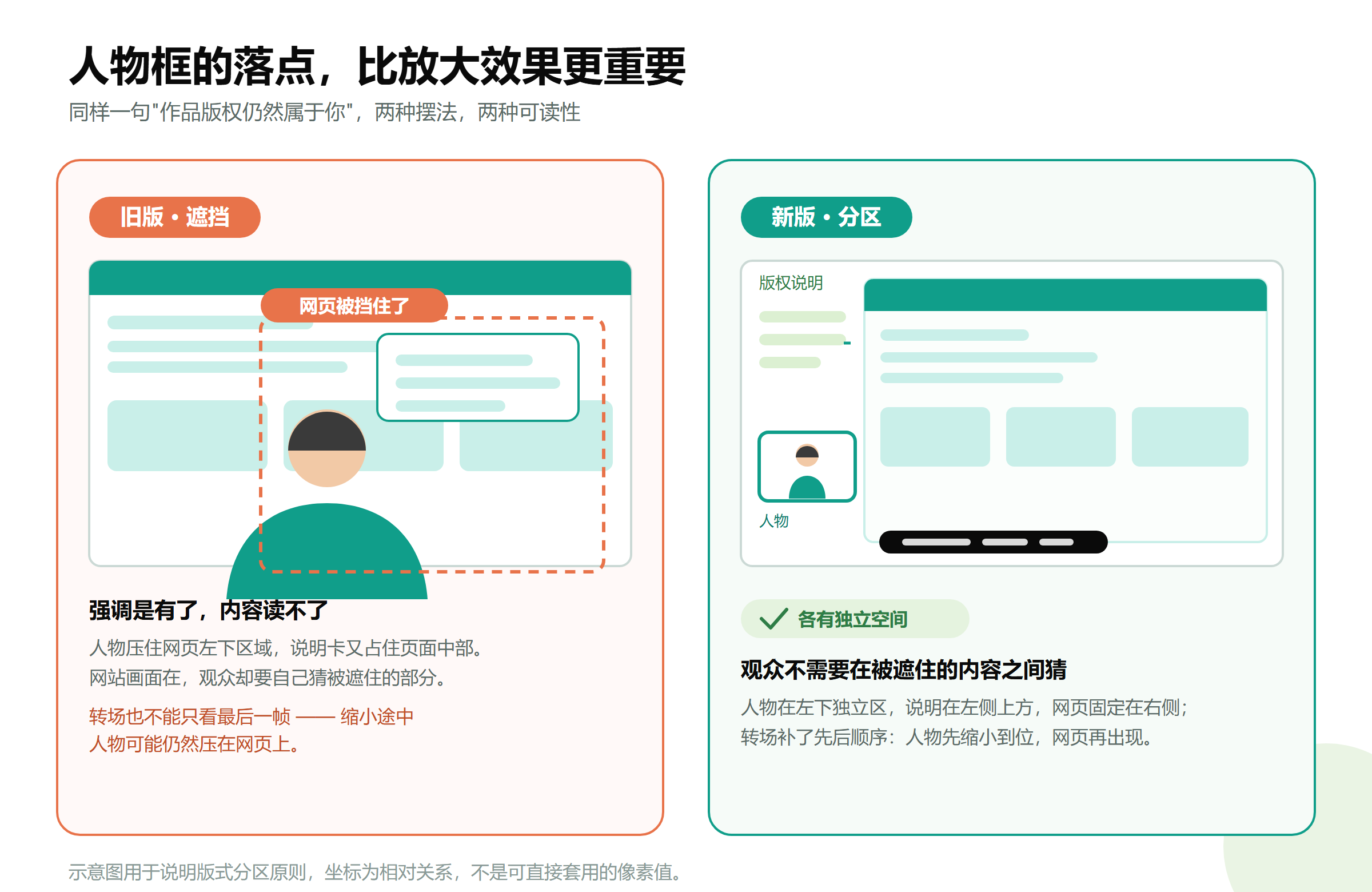
After correction, the layout became clear: Character placed in an independent bottom-left area, copyright notice in the upper left, and the webpage fixed on the right. Viewers didn't need to guess between obscured content.
Also, transitions shouldn't be judged only by the last frame. Even if the character stops in the correct position eventually, they might continue covering the webpage during the shrink-from-fullscreen animation.
I added sequencing to this transition: The character shrinks into place first, then the webpage appears; when the character prepares to zoom in, the webpage and page title fade out first. This ensures the page has stable space during readable phases, preventing it from being covered by a moving character while being displayed.
Checking other segments revealed that the small character window in the relationship diagram touched the bottom edge of the first card. This was also adjusted, ensuring spacing between the character, cards, and bottom subtitles.
Check Real Pages After Removing Browser Decorations
Early page displays used a mock browser frame with three colored dots and an address bar at the top. It made the visual look like a computer window but took up display space.
Based on feedback, I removed these decorations, keeping only the website page itself.
Then a second problem emerged: To leave room for the explanatory area on the right, the Alliance page only showed part of the screenshot and set an upward offset. As a result, the website's own top navigation was cropped and obscured.
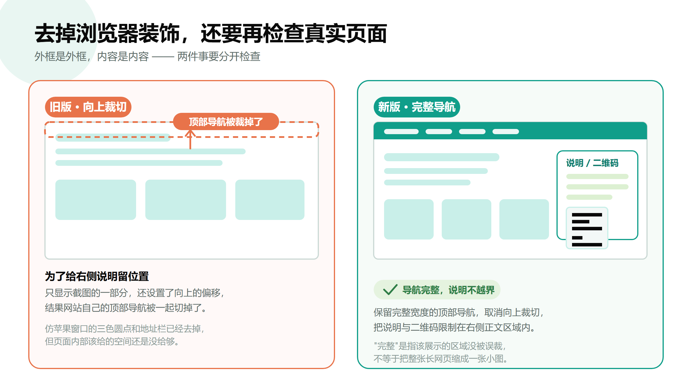
The final fix retained the full-width top navigation, canceled the upward crop, and limited QR codes or benefit explanations to the right-side body area. I also corrected the wrong active state in the navigation within the local display visuals, without modifying the live website.
"Complete" here means the designated display area hasn't mistakenly cropped navigation or key information, not necessarily shrinking an entire long webpage into a small thumbnail. Long pages still require selecting parts relevant to the voiceover for display.
Additionally, exporting in 1080P doesn't mean all source assets have native 1080P detail. The character source material for this video was approximately 1264×720; the output canvas was 1920×1080, with titles and subtitles rendered by code. Post-production can improve typography and readability but cannot magically restore details absent from low-resolution originals.
Subtitles Must Be Centered Relative to the Entire Screen
Subtitles looking roughly positioned doesn't mean they are truly centered.
Early subtitles had inconsistent left/right margins to avoid the character, visually biasing towards the right. Later, I re-aligned them based on the center of the entire 1920-pixel width, fixing subtitles at the bottom center, and solving occlusion by moving the character instead.
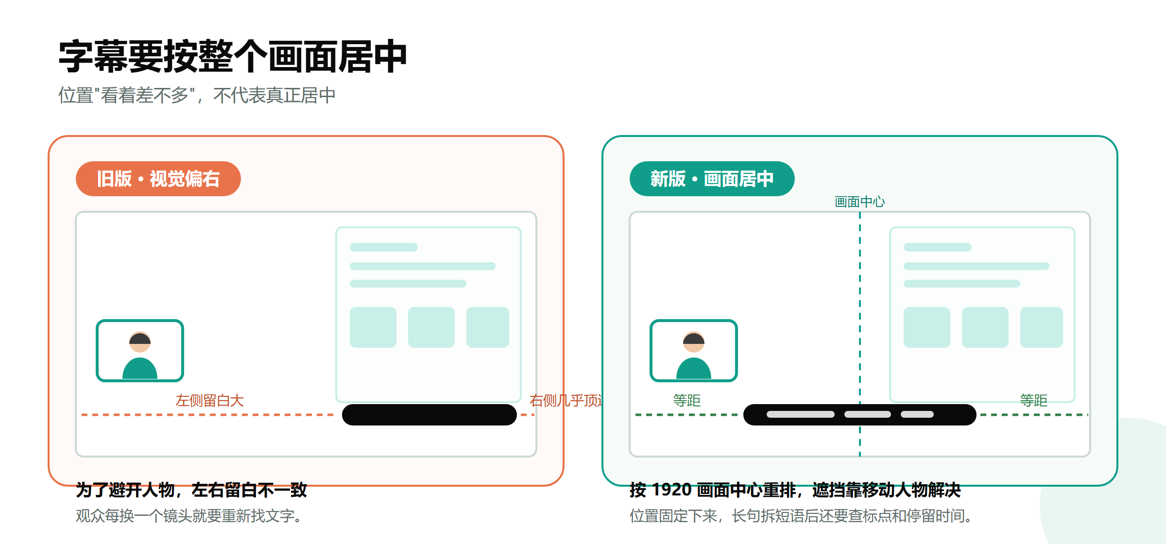
Stable positioning is crucial. Moving subtitles with every shot forces viewers to repeatedly search for text. After breaking long sentences into phrases, check punctuation at line starts, line breaks, and dwell times.
The subtitles for this video were based on proofread text and existing timing info, with some intra-sentence phrase timings estimated. Don't interpret "no overall audio track shift" as "every word underwent forced alignment," nor assume the character's mouth movements were regenerated accordingly.
During checks, I separated three layers: Are there typos? Do subtitles appear at appropriate times? Is there new misalignment between audio and original character actions?
Why Keep Two Endings for One Video?
When preparing a video for external use, consider where it will be posted.
I kept two versions. The public platform version excludes off-site QR codes and URLs, ending with an explanation of the Creator Alliance's content value; the targeted invitation version retains the QR code I placed at the end, allowing interested creators to learn more directly.
This isn't a trick to guarantee unlimited reach. Platform moderation, commercial promotion rules, and available account conversion channels need separate verification; low view counts cannot be directly attributed to a specific QR code.
The QR code wasn't redrawn by a generative model but embedded directly as the original image. After encoding, I extracted frames from the video to verify recognition at different timestamps, confirming the correct address could still be read. Being scannable in the original image doesn't guarantee reliability after scaling, transitions, and compression.
The final visuals also retained the digital human label. When publishing generated synthetic content, proactively declare it and use the platform's labeling features as required; removing necessary labels is not a valid post-production optimization. [1]
Do a Round of Checks After Successful Export
The most valuable takeaway from this time was the final checking method.

I performed full-decode checks on both video versions to ensure files could be read completely; sampled frames across the entire storyboard, adding checkpoints near the Talent page, Alliance page, and key transitions; calculated character and page positions frame-by-frame during webpage displays to confirm no rectangular overlaps.
For audio, I compared data and timestamps between the revised version and the previous track to confirm layout changes didn't alter the confirmed audio. For the invitation version, I re-verified scan results at multiple timestamps.
These checks solve different problems. Normal decoding doesn't mean correct layout; geometric non-overlap doesn't guarantee visual comfort; scannable QR codes don't mean promotional content has received platform permission. Tools provide evidence, but humans still need to watch the visuals, listen to the audio, and judge if the information is clearly communicated.
All delivered versions were retained, with fixes saved as new files. This allows comparing changes and reverting to old versions if new approaches prove unsuitable.
Next Time I'll Follow This Order
First, define the target audience and clarify what content and boundaries can genuinely be offered.
Finalize the voiceover script, create short previews, and generate the full segment only after confirming the voice.
Split according to actual upload limits, maintaining consistency in character and scene.
Create a small "character explanation + website demo" segment first to validate layout before expanding.
Define fixed areas for the character, pages, explanations, and subtitles.
Use the main timeline to organize assets uniformly, integrating independent motion graphics as clips.
Lock the audio before fine-tuning visuals; synchronize all related tracks when adjusting speed.
Output different versions based on usage scenarios, checking the final render, not just the editor preview.
After finishing this time, I obtained a ~77-second digital human promo video and left behind a project structure that can continue to be modified.
For me, AI reduced some production work for characters, voices, and visuals, but didn't replace content judgment and final quality checks. What truly impacts viewing experience is often these specific details: Was a sentence stated accurately? Was a page section blocked? Can a QR code still be scanned in the final video?
Next time I do a similar project, I'll confirm these issues earlier, rather than waiting until the entire video is finished to start over from scratch.
References
[1] Cyberspace Administration of China, Measures for Labeling Artificial Intelligence Generated Synthetic Content, Article 10 cac.gov.cn/2025-03/14/c_1743654684782215.htm
Remotion Official Docs remotion.dev/docs | HyperFrames Official Intro hyperframes.heygen.com/introduction
This retrospective covers the actual workflow of this project. Upload limits mentioned refer to the conditions of the interface used at the time; tool features, plans, and publishing rules may change, so please verify current information when using.

